Mawley Milk
The Brief
Our brief was to update their logo and packaging. Mawley Milk have a rich history and their original logo first appeared in 1982. It was hand-drawn by a friend with the strap line ‘The Dairy on Your Doorstep’. Mawley Milk has come a long way since then.
They now have an impressive robotic milking parlour, wind turbine and anaerobic digester on the farm. With all these changes, it was time for a refresh when it came to the branding and labels.
What We Did
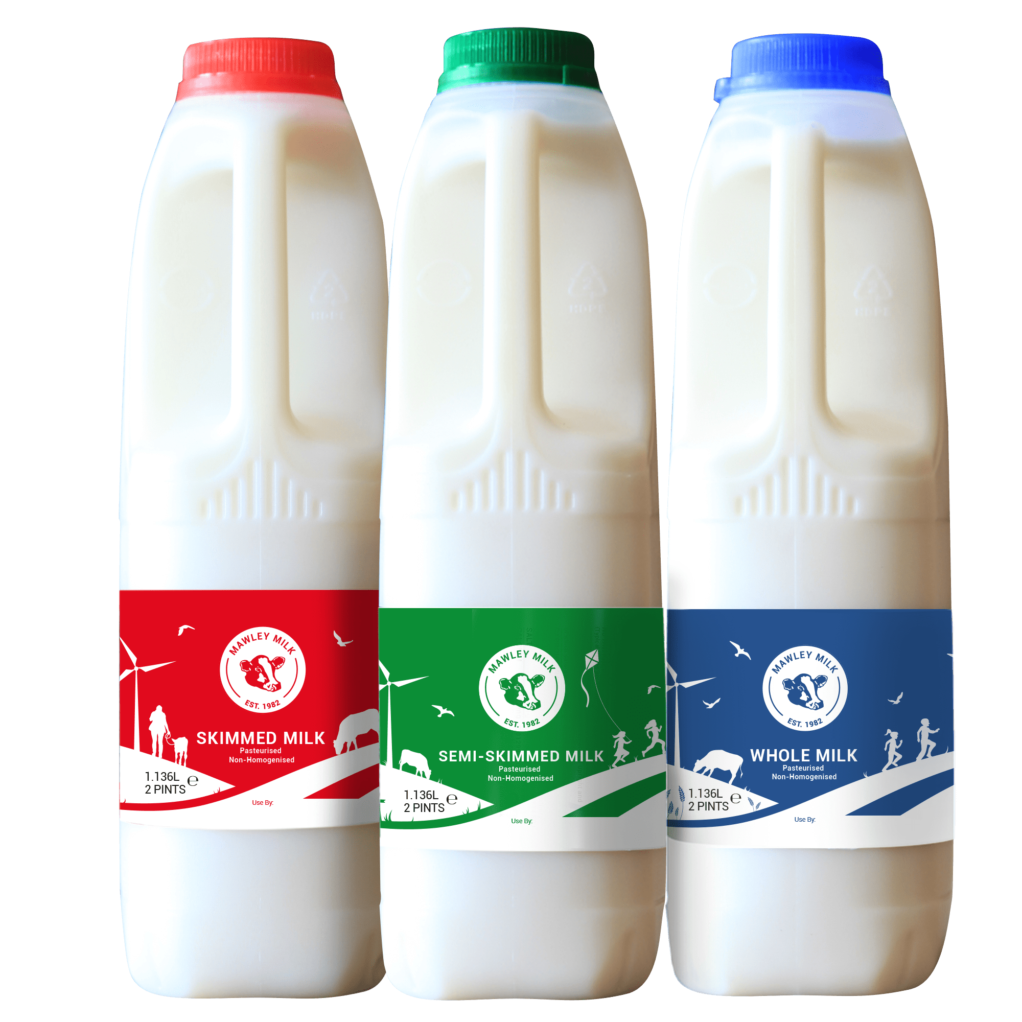
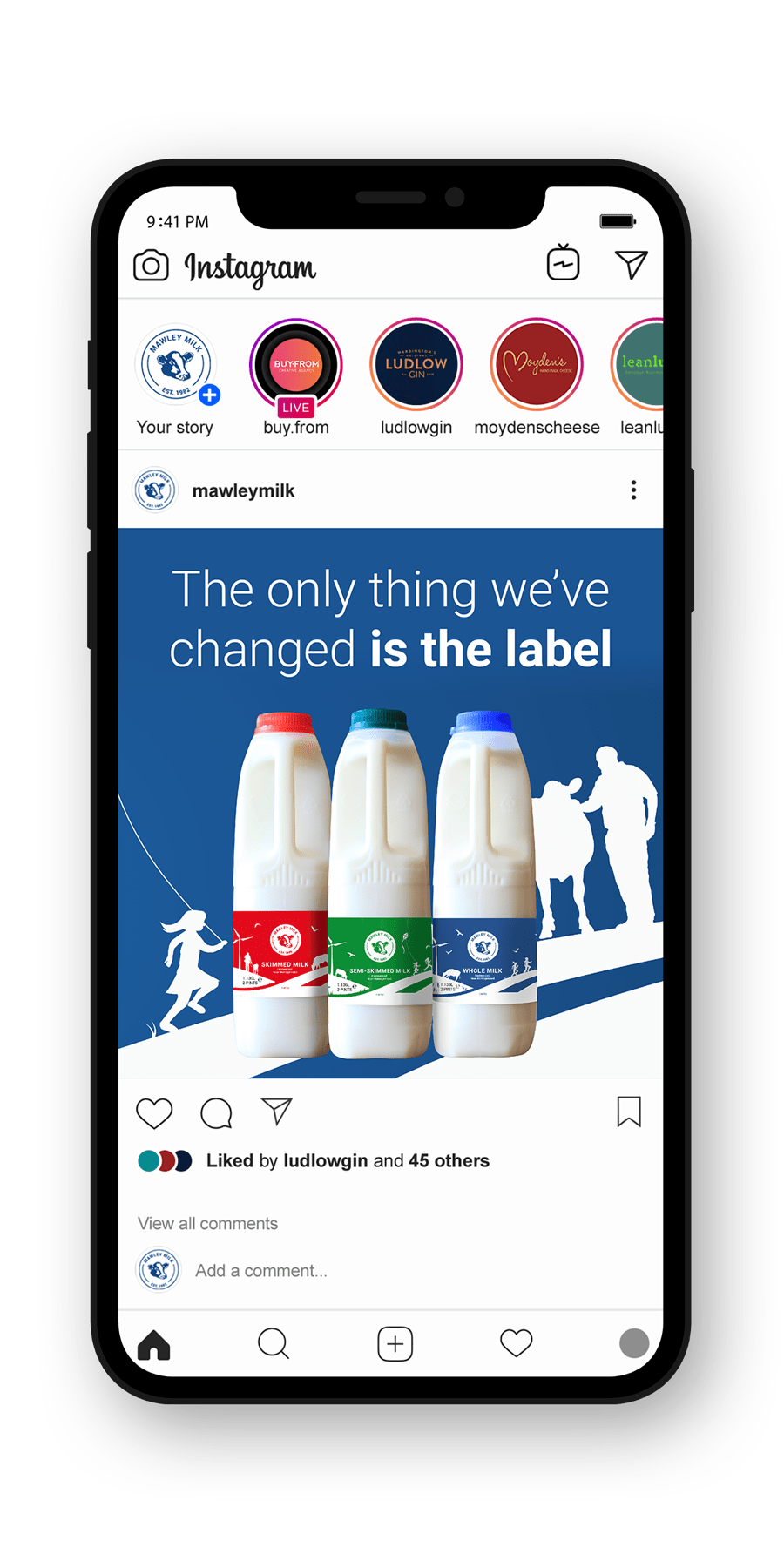
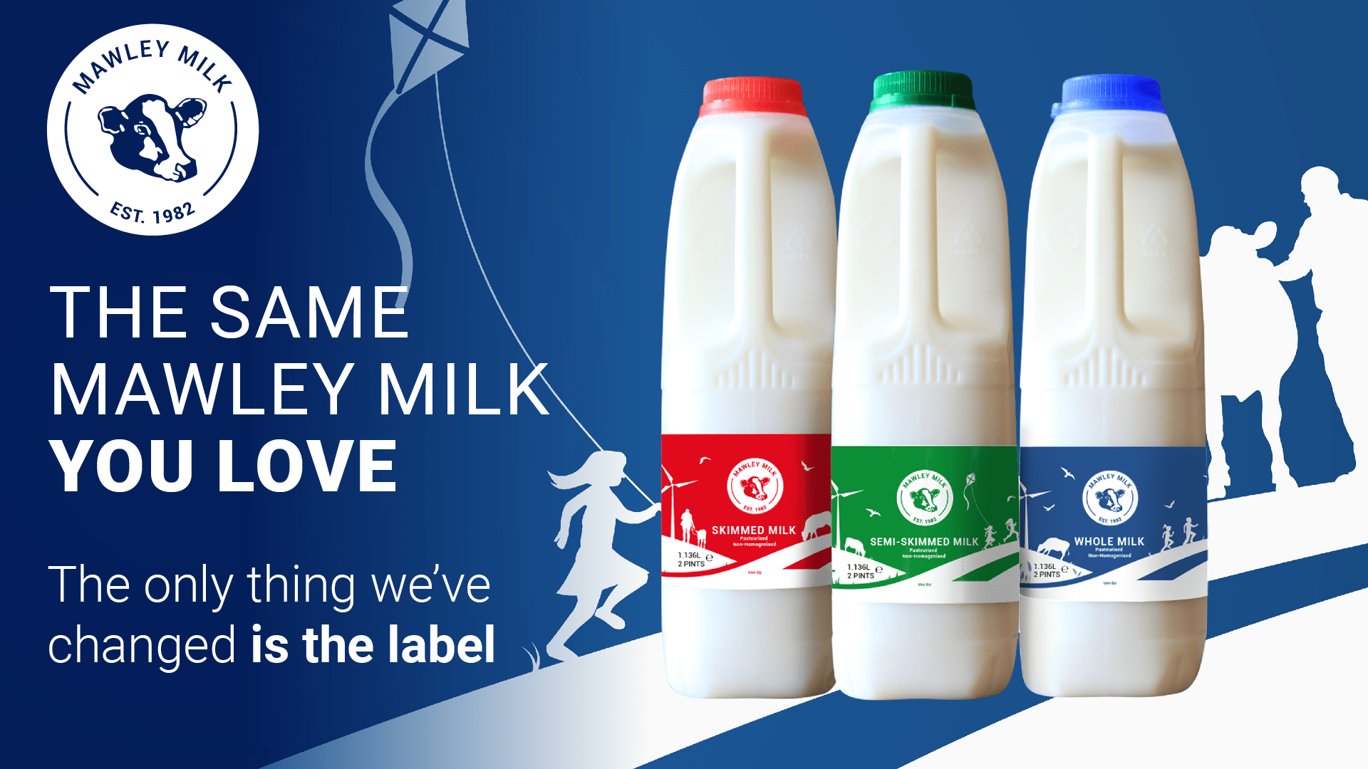
We needed to apply fresh approach to the locally well-known brand, whilst keeping the original feel. Our design work incorporated the new technology and the environmentally friendly aspects of Mawley Milk. We modernised the logo by simplifying the outline and making it cleaner whilst keeping the iconic cows head.
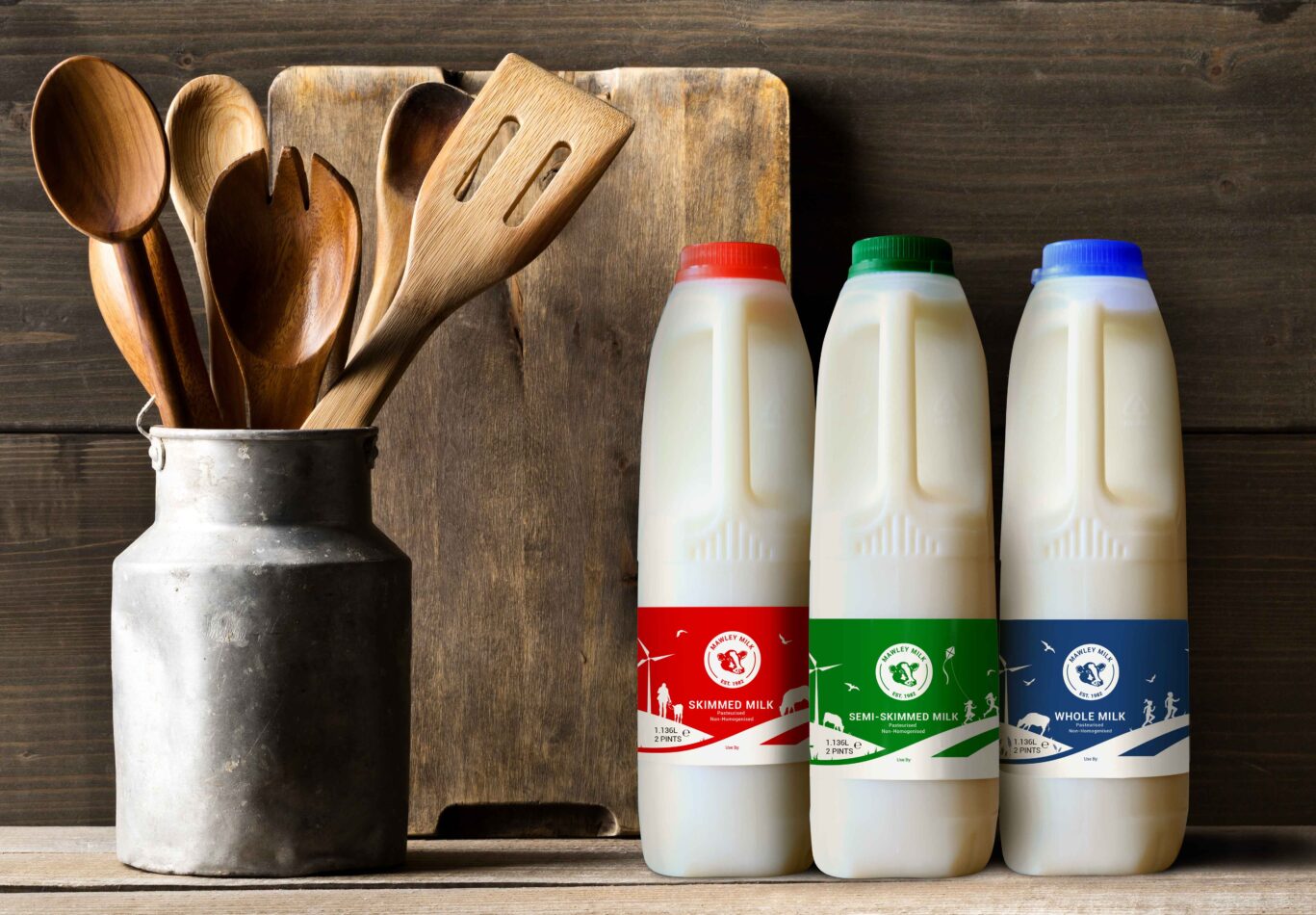
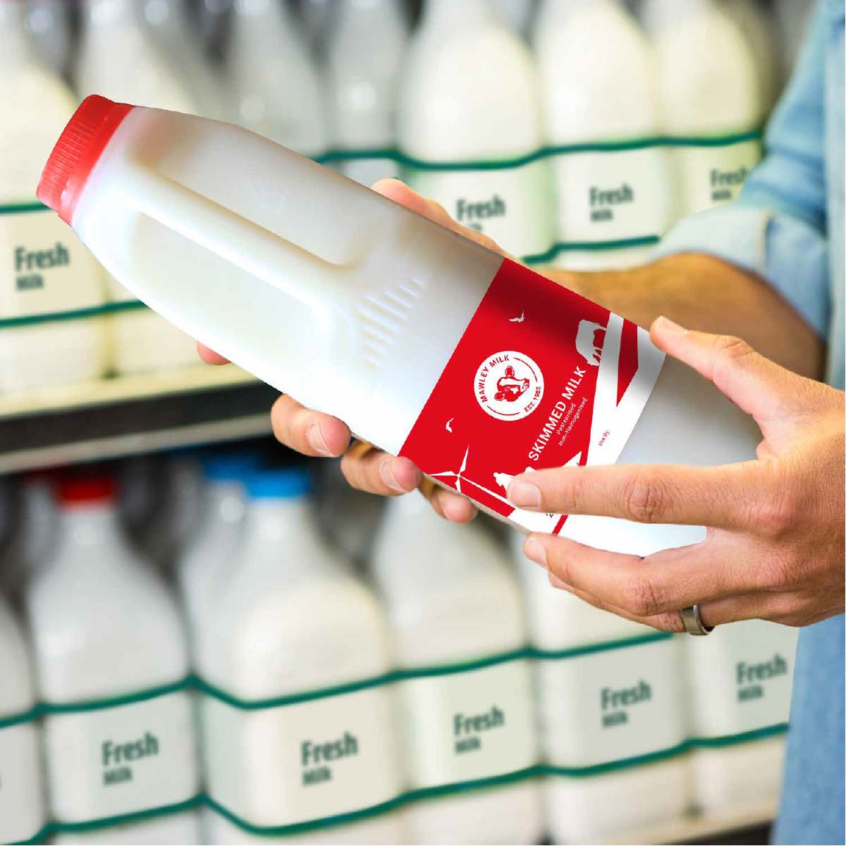
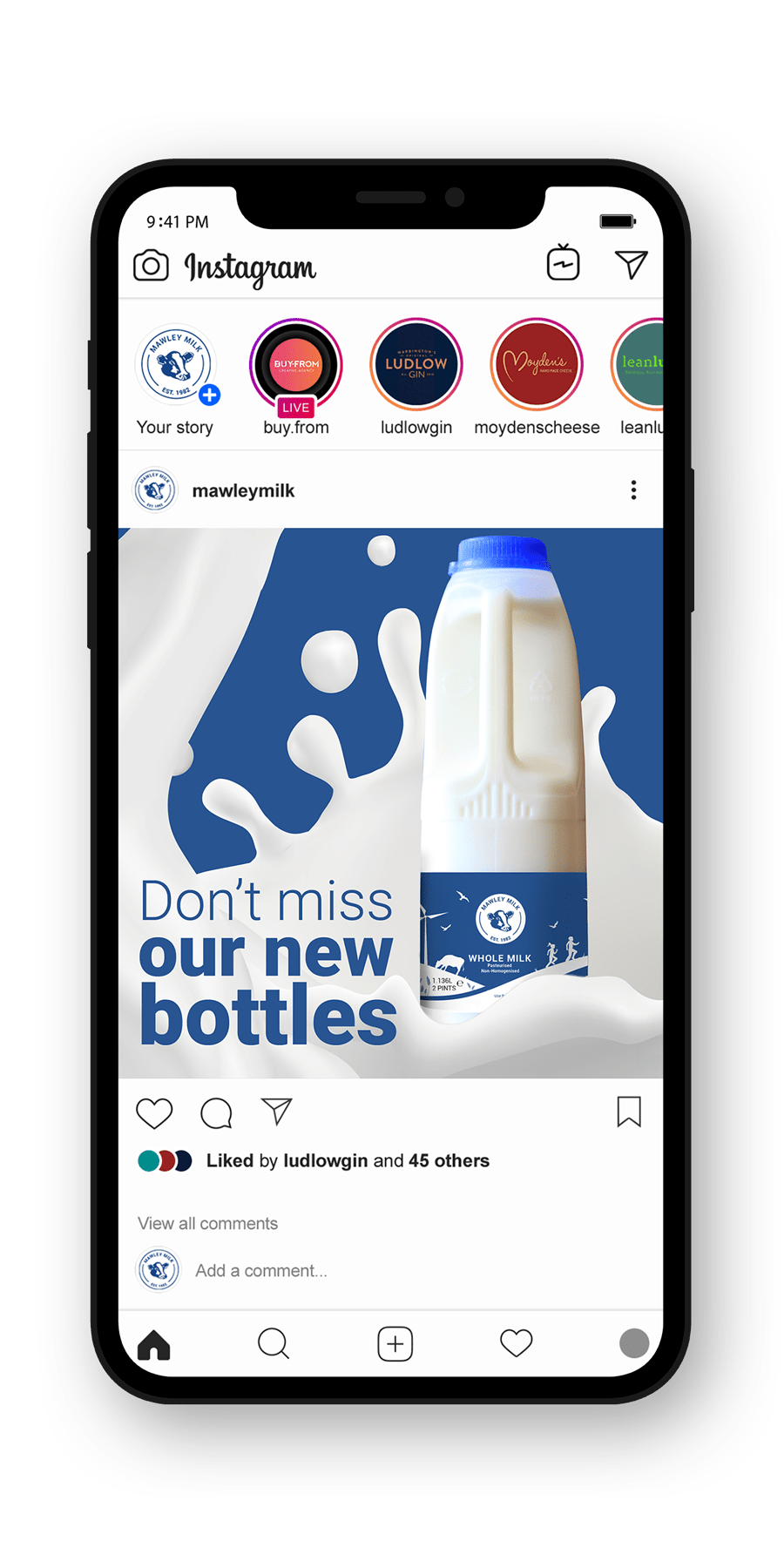
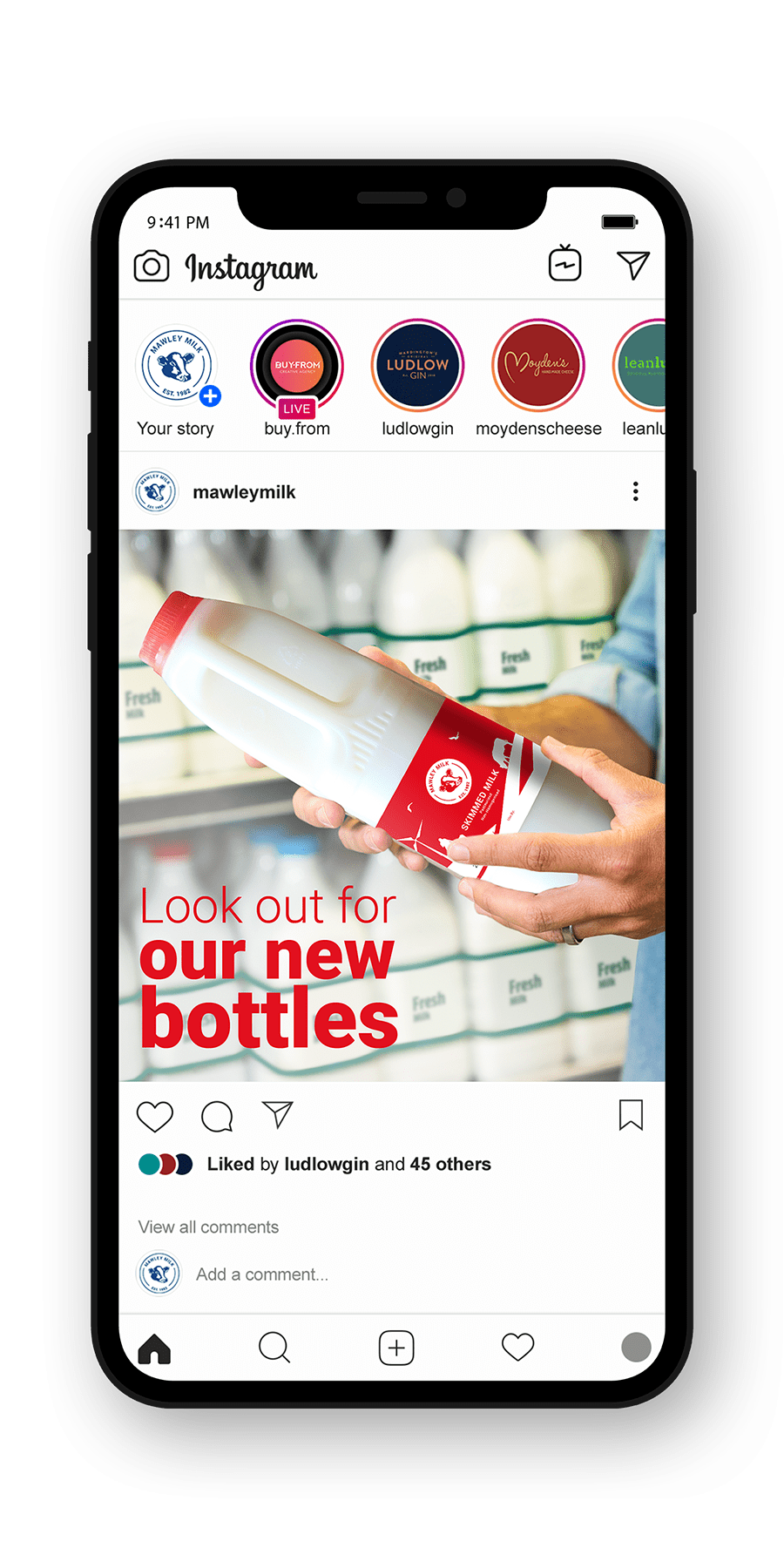
For the labels, we really wanted to tell the story of Mawley Milk and bring aspects of ‘day to day’ life on the farm into the design. Chatting with Rachel, we decided that most people are sat at the breakfast table when they enjoy their milk and we wanted the labels to be meaningful when customers looked at them.
Storyboards were created for each milk and then we created the icons. We finally pulled it all together with the essential info and ended up with the labels you see today.
What they Said
“The Buy-From team bring enthusiasm, energy and creativity to everything that they do. We have really benefited from their dynamic businesses support and approach to marketing. We are absolutely thrilled with the rebrand, which perfectly reflects who we are and what we do.”
Rach Robinson, Partner